
The Psychology Behind Which Paintings Work in Modern Homes
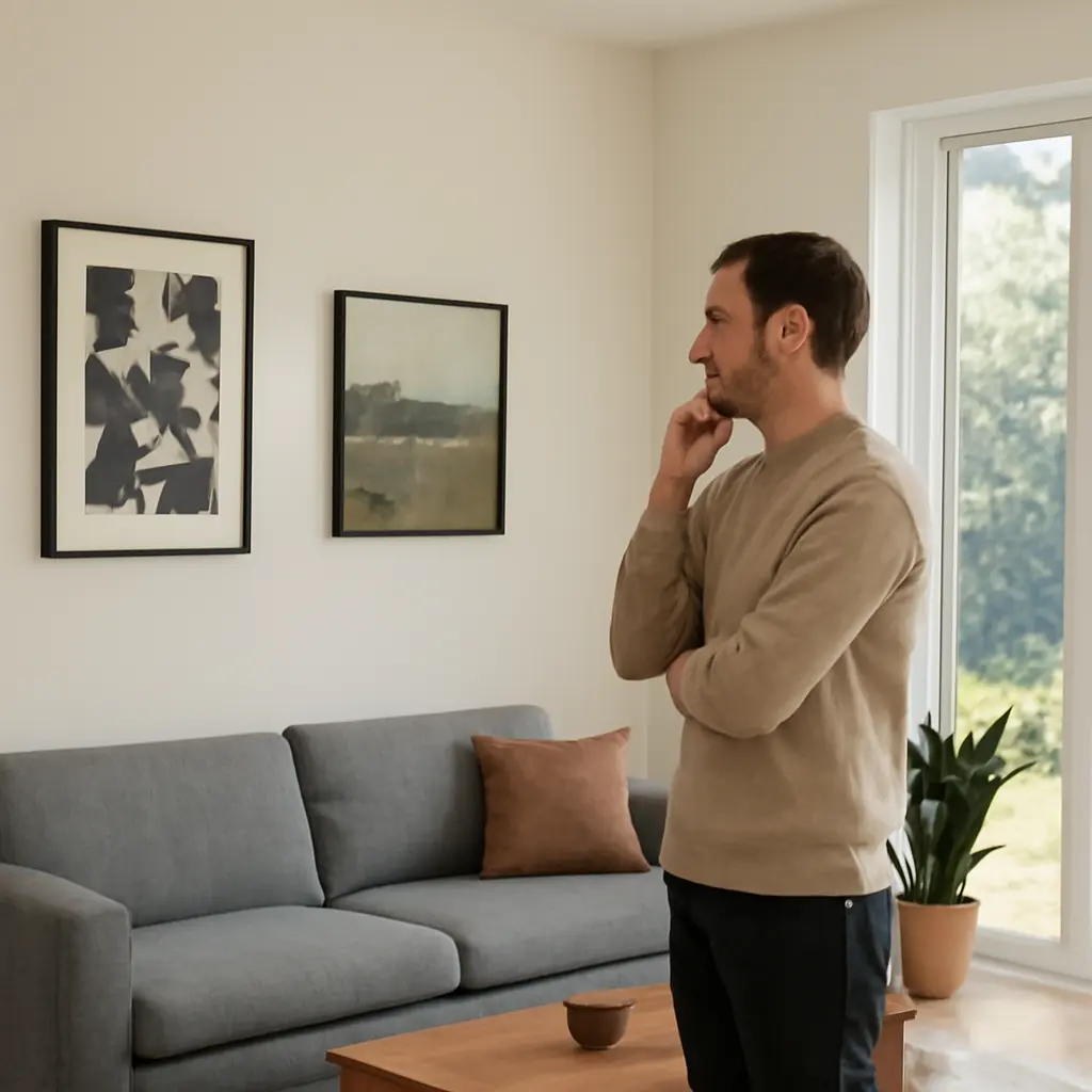
Paintings that work in modern homes are artworks whose color, subject, scale, and visual complexity support both the room’s function and the way its occupants want to feel. Environmental psychology suggests that people respond to images through attention, emotional associations, and personal meaning—not simply through matching colors. Research on art in healthcare and workplace settings has found that visual art can influence mood and stress, while a 2023 Houzz survey reported that 44% of renovating homeowners planned to decorate or upgrade their interiors. The most useful choices therefore balance perceptual comfort, emotional resonance, and the practical demands of the space.
How painting selection shapes psychological experience in modern homes
A painting’s psychological effect is the response it helps evoke through its visible features and the viewer’s interpretation. Environmental psychologist Roger S. Ulrich’s research on visual environments, including his 1984 study of hospital patients, is often cited as evidence that views of nature can support recovery: patients whose rooms looked onto trees had shorter postoperative stays and required fewer doses of strong pain medication than those facing a brick wall. That study concerned real views rather than paintings, so it does not prove that a landscape artwork produces the same clinical outcome. It does, however, help explain why natural imagery is commonly used to create a sense of refuge.
The effect of art is not universal. A calm image to one person may feel empty to another; a vivid abstract composition can energize one room while overwhelming a different viewer. Useful categories include naturalistic paintings, abstract works, figurative art, and culturally or personally meaningful images. Each works through a different mix of visual stimulation, recognition, and association.
Visual complexity and attention
Visual complexity describes how much variation, detail, contrast, and organization an image contains. In a 2004 experiment published in Empirical Studies of the Arts, researchers Nicki Leder, Helmut Leder, and colleagues examined how people judged the complexity and appeal of artworks. Their work supports a practical principle: viewers often respond best when an image is neither trivially simple nor so complex that it is difficult to process. This is not a fixed formula for choosing art, but it helps explain why a clearly organized composition can feel engaging without becoming visually exhausting.
In a bedroom or reading nook, a painting with open space, gentle contrast, and a legible focal point may support quiet attention. A busy entryway or social room can accommodate sharper contrasts and more intricate detail because the image is encountered in shorter bursts. Match complexity to the room’s role and to the amount of visual activity already present, including patterned upholstery, shelving, and screens.
Color, mood, and context
Color is a perceptual feature, not a guaranteed emotional switch. Studies of color and emotion, including research by psychologist Andrew J. Elliot and Markus A. Maier, show that color associations depend on context, culture, and task. Blue may be linked with calm in one setting but feel cold in a dim room; red may signal warmth, urgency, or celebration depending on the image and the viewer.
A painting should be judged alongside the room’s daylight, artificial lighting, wall color, and furnishings. A simple test is to view a candidate at different times of day and from the places where people actually sit. Rather than relying on rigid claims such as “green always relaxes,” consider whether the artwork’s palette feels coherent and comfortable in that particular home.
Personal meaning and emotional response
Personal meaning is the emotional significance a viewer attaches to an image through memory, identity, culture, or experience. Research on aesthetic appreciation by Helmut Leder and colleagues describes art viewing as a process involving perception, interpretation, and evaluation. A familiar coastline, family portrait, or locally significant scene may therefore feel more compelling than a technically accomplished image with no personal connection.
This matters especially in shared homes. Discuss what household members notice or associate with a work before treating it as a purely decorative decision. Personal relevance does not require sentimental subject matter: an abstract painting can hold meaning through its colors, materials, or connection to a particular artist or place.
How painting types support different needs in modern interiors
Once the psychological dimensions are clear, painting categories can be compared by the experience they are likely to support. These are tendencies, not prescriptions; subject matter, composition, and individual preference can matter more than the category alone.
Nature paintings and restorative cues
Nature paintings depict landscapes, plants, water, or other elements of the natural world. They can provide a visual point of rest and a reminder of outdoor environments, making them a common choice for bedrooms, home offices, and recovery spaces. Ulrich’s hospital research provides relevant evidence for the potential value of nature views, but it should be treated as context—not as proof that a painting will produce the same health effects.
For a restful effect, consider a landscape with a clear horizon, gentle shifts in tone, or an open composition. For a more lively effect, choose stronger weather, dense vegetation, or a close-up botanical image. The best choice depends on whether the room needs visual quiet or a focal point with energy.
Abstract paintings and open interpretation
Abstract paintings use color, line, shape, and texture without necessarily depicting recognizable objects. Their ambiguity invites viewers to form individual interpretations, while their formal qualities can connect with the architecture or palette of a room. An orderly geometric work may create a sense of structure; a gestural composition may add movement and spontaneity.
Abstract art is not automatically calming or contemporary in psychological effect. High contrast, dense marks, and rapid directional movement can feel stimulating. To assess fit, look at the painting from the room’s main viewing distance and notice whether the eye can find a stable point or whether it keeps being pulled around the composition.
Figurative paintings and social connection
Figurative paintings show recognizable people, animals, or scenes. Because viewers can identify expressions, gestures, and relationships, these works often prompt narrative interpretation and conversation. Portraits may communicate intimacy or identity, while scenes of everyday life can make a space feel inhabited and socially warm.
The emotional effect depends on what is shown and how. A welcoming expression, an active gathering, and a solitary figure can suggest very different moods. In shared spaces, consider whether the image feels inviting to the people who use the room, rather than selecting it solely because it matches the furniture.
Cultural and personally significant artwork
Culturally significant art connects a home to heritage, community, or a particular historical tradition. Personal collections can do similar work through travel memories, family history, or support for living artists. Such paintings can strengthen a sense of identity and belonging, but their meaning should be understood in context rather than reduced to a decorative motif.
A thoughtful approach includes learning about the artist and the work’s cultural background, especially when choosing art from a community outside one’s own. Provenance and respectful presentation matter alongside visual fit. In a home, a meaningful work can serve as both a focal point and a daily connection to a story.
How scale, placement, and room function affect painting response
A psychologically suitable image can still feel wrong if it is poorly scaled or placed. Viewing distance, lighting, wall area, and the activity taking place in the room shape how easily a painting can be seen and how strongly it commands attention.
Scale and visual balance
Scale is the relationship between the artwork’s size and the wall, furniture, and viewing distance around it. A small painting on a broad wall may seem disconnected, while an oversized, highly detailed work can dominate a compact room. As a starting point, designers often hang art so its center is near average eye level—approximately 57 to 60 inches from the floor—then adjust for furniture, ceiling height, and the people who use the space. This is a design convention, not a psychological law.
Before hanging, mark the proposed dimensions on the wall with painter’s tape or place a paper template there. Check the composition from the doorway and from the room’s main seating position. This low-cost trial reveals whether the artwork feels proportionate before installation.
Placement and room purpose
Room purpose determines how often and how attentively people encounter a painting. A dining area supports conversation, so a work with a clear focal point can become a shared reference. A home office may benefit from imagery that feels engaging without repeatedly diverting attention from tasks. In a bedroom, the image is often viewed at close range and during quieter routines, making personal comfort especially important.
Place the work where it can be seen without glare, obstruction, or an awkward viewing angle. Avoid assuming that every wall needs art: visual breathing room can help a significant painting stand out and keep a room from feeling crowded.
Lighting and material presentation
Lighting changes how color, texture, and contrast appear. Daylight shifts throughout the day, while bulbs vary in color temperature and brightness; glass can also introduce reflections. The Smithsonian Museum Conservation Institute advises limiting light exposure for sensitive works on paper because light can cause irreversible fading. Even for less fragile paintings, direct sun and heat can damage materials over time.
Use indirect, stable lighting where possible and follow conservation guidance for valuable or delicate works. For original paintings, check the artist’s or conservator’s recommendations about humidity, framing, and UV protection. A painting that looks comfortable under both daylight and evening lighting is more likely to remain a practical fit.
How to choose paintings using evidence and real-world testing
Selecting art is best treated as a small, reversible experiment rather than a one-time guess. The goal is not to diagnose a mood from a color chart, but to observe how an image behaves in the actual room and how household members respond to it.
A practical evaluation method
Compare candidate works using the following steps:
- Identify the room’s main purpose and the experience you want the artwork to support.
- Choose several candidates with different levels of complexity, subject matter, and color intensity.
- Use paper templates or digital room previews to test scale and placement.
- View the candidates at the room’s usual times of day and under the lighting used in the evening.
- Ask each regular occupant what they notice, feel, or associate with the work.
- Live with a temporary print or sample image before committing to a costly purchase, when possible.
This process reflects a broader principle in environmental psychology: responses arise from the interaction between a person and a setting. It also reduces the risk of choosing art based only on a product photograph, which cannot show the effects of the room’s lighting, furniture, and viewing distance.
A real-world example: art in healthcare settings
Hospitals and clinics offer a useful example of art selected for more than appearance. Ulrich’s 1984 study compared patients with different window views and found better recovery measures among those with a view of trees. Later healthcare design practices have often included calming imagery, but outcomes depend on the population, setting, and type of art. A nature painting in a waiting room may make the environment feel less sterile to some visitors; it should not be presented as a substitute for treatment or as a guaranteed stress intervention.
The lesson for homes is modest but useful: consider the emotional task of a space, then test whether the artwork supports it for the people who live there. A painting can contribute to a welcoming, restorative, or stimulating environment, but its effect is shaped by the whole room and the viewer.
Conclusion: choosing paintings that feel right at home
The psychology behind paintings in modern homes involves visual complexity, color in context, personal meaning, subject matter, scale, placement, and lighting. Nature paintings may offer restorative cues; abstract works can invite open interpretation; figurative art can encourage narrative and connection; and culturally significant pieces can express identity and belonging. Research provides useful context, but it does not establish a universal painting that will produce a particular mood for everyone.
Choose artwork by considering the room’s purpose, the people who use it, and the way it looks in the actual space. Test scale and lighting, discuss personal associations, and learn about the work’s background. For further reading, consult environmental psychology research, museum conservation guidance, and writing by the artists whose work you are considering.
Sources: Roger S. Ulrich, “View Through a Window May Influence Recovery from Surgery,” Science, 1984, https://www.science.org/doi/10.1126/science.6143402; Nicki Leder, Helmut Leder, et al., research on complexity and aesthetic appreciation, Empirical Studies of the Arts, 2004; Andrew J. Elliot and Markus A. Maier, “Color Psychology: Effects of Perceiving Color on Psychological Functioning in Humans,” Annual Review of Psychology, 2014, https://doi.org/10.1146/annurev-psych-010213-115035; Helmut Leder et al., “A Model of Aesthetic Appreciation and Aesthetic Judgments,” British Journal of Psychology, 2004, https://doi.org/10.1348/0007126042369811; Houzz, 2023 U.S. Houzz & Home Study, https://www.houzz.com/magazine/2023-u-s-houzz-and-home-study-renovation-trends-stsetivw-vs~167491493; Smithsonian Museum Conservation Institute, “Care of Works of Art on Paper,” https://mci.si.edu/care-works-art-paper.
Related Post

Building Depth Through Repetition And Variation
Writing depth through repetition and variation is the deliberate development of meaning, coherence, and emotional [...]
Canvas Texture and Longevity What You Need to Know First
Canvas texture is the visible and tactile character of a woven fabric—its grain, surface irregularities, [...]